My Kitchen | Before & After
Remember a few months ago when I confessed my love for HGTV? Right around that same time I was brainstorming ways to improve our kitchen. I had just watched an episode of Sarah’s House (my favorite show!) which had given me a little hope that perhaps *we* could transform our ho-hum kitchen into something a little bit better.
So here’s how it looked before we started:
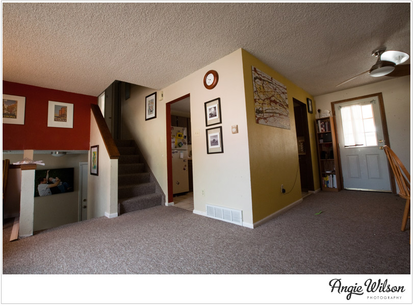
(view from the living room looking towards the kitchen)
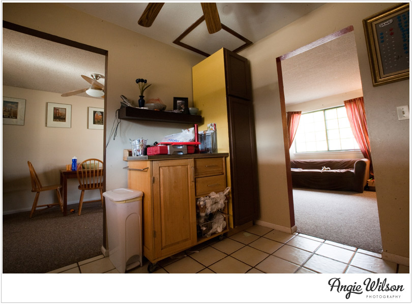 (view from inside the kitchen looking towards the living/dining room)
Yuck. I’m embarassed to even have my logo on that. :)
What I didn’t like about it? Well, lots. But mainly:
The isolation in the kitchen. Trying to have a conversation with someone in the living and/or dining room while I was in the kitchen was weird. I like to see people when I talk to them.
Carpet in the dining room. Sick. Perhaps it works for some people, but not for our family with two messy little eaters.
Counterspace in the kitchen wasn’t great. Obviously these photos don’t show the cabinet/counter side of the kitchen, so you’ll just have to take my word for it. Spreading out while we cooked wasn’t really an option.
Jim and I went through several different ideas for kitchen renovations. The first involved replacing all of the cabinets, flooring, lighting, appliances, etc. etc. After we pulled out the calculators we opted against that option, as, let’s be honest, we didn’t want to spend that much money! : )
Here’s what we decided to do: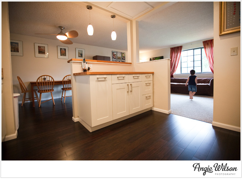
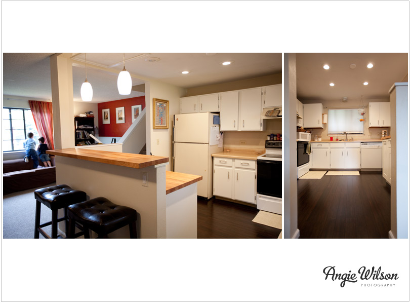
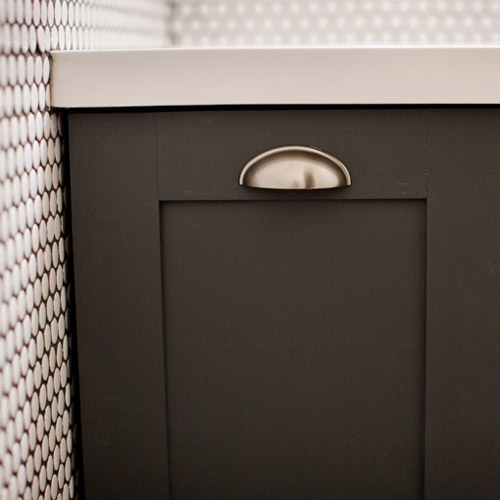
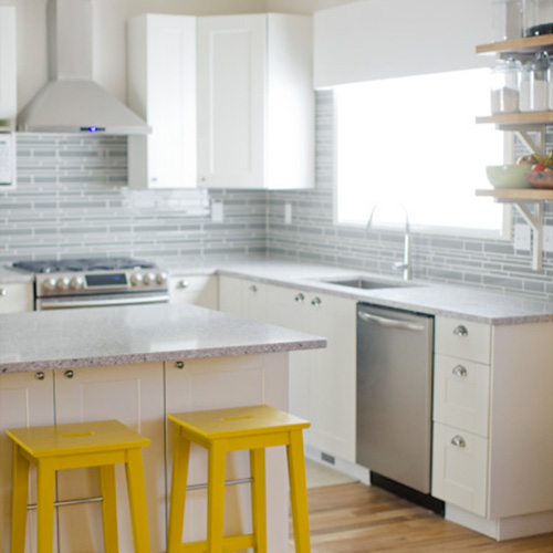
Tah-Dah! 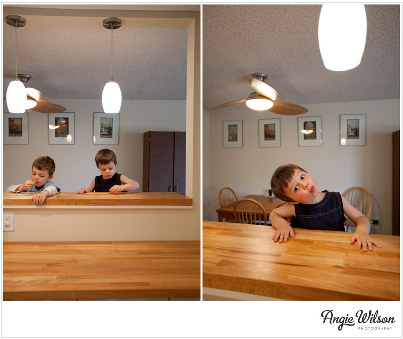 No, its not my dream kitchen, but being in my kitchen today feels like a 145% improvement over what it used to be. What I love about it now:
I have LOTS of COUNTERSPACE!
James and Colin can eat breakfast/do homework/chit chat with me at the breakfast bar while I’m chopping. We’re all in the same space!
Mmmm….do you see that new dark bamboo floor? Isn’t it delicious?
**Lots of thanks to my father-in-law who coached us through the whole process!!**





Wow Ange! I’m so impressed! That is a huge difference! Maybe you should go into remodeling consultation!
Nice job!! It looks great! That is the best looking bamboo floor. (seriously, what is it with carpet in the dining area?) I also like the fan.
I love it! Nice work!
ang! (and jim!) it looks amazing! the open space and floor are my favorite. you guys are awesome!
Love it! Especially the flooring. I’m so jealous! And love those adorable boys!
That looks AMAZING!! Love the floor and the cabinets have such crisp, clean lines!
LOVE IT. what a great job Angie. and i’m not surprised with you’re artistic touch! just beautiful…
I love it too! The counter space, the open feel, the lighting, that gorgeous floor, the bar stool… Awesome job! And your boys are getting so big and handsome too!
oh my goodness, sarah’s house is my favorite too!! the farm house???!!! oh my…in my dreams. she is amazing. your kitchen looks fantastic, and I love your new floors!
thank you thank you thank you! :)
WOW Angie!!! I’m a little late to this game….but what a Complete Transformation! I absolutely love your new floor and the contrast from the white cabinetry. Isn’t it amazing how much of a difference a half corner wall can make in opening up a room. You both did a phenomenal job!